From the Artist
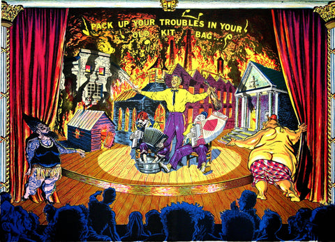
Very briefly I would just like to say that the present electoral climate influenced the imagery.
Technically—I wanted to use the color separation process very much in the way commercial printing breaks down color—in primary colors: yellow, magenta, and cyan (blue) with a black key propped on top.In this way, the print would have a feel like comic books. To further that feeling, I relied heavily on chart pack dot patterns for both grainy and mechanical textures. The challenge in this way of approaching color is to produce as wide a range of the color spectrum with a limited means—earth tones and secondary colors being a bit tricky, and I might add, a bit more "contrived," which again was the look I was after. Another effect I wanted was an enriched texture from the moiré patterns that are created by the overlapping and offsetting of the chart pack dot patterns.
—From Brandywine Workshop and Archives records